HMI Extreme Makeover: Customizing a Navigation System for Your Industrial Interface
A makeover story is easy to spotlight because it is so visual: we can see the “before and after.” But what about when the transformation happens beneath the surface? In our last post, we discussed HMI design makeovers, focusing on the external factors that make for great industrial interface design. This time, we’re diving deeper into the backbone of HMI screens: the navigation and wayfinding.
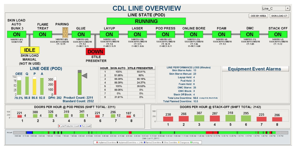
At our ICC 2017 session, "Making Your HMIs More User-Friendly," Co-Director of Marketing Steven Fong, Design Services Manager Stevenson Yuan, and myself (UI/UX Designer Ray Sensenbach) redesigned three real Ignition HMI examples to make them more intuitive and efficient, and to improve their overall performance. One HMI example from these projects stood out as needing a wayfinding overhaul:
One screen from these projects stood out as needing a wayfinding overhaul:
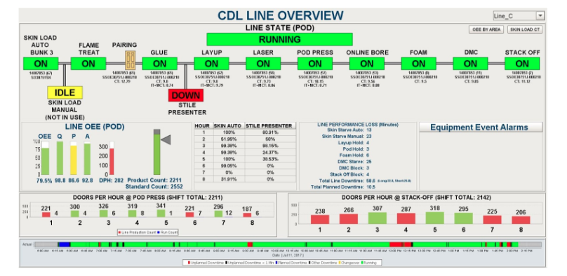
Our team found this screen challenging to navigate, and thought there were several ways to easily improve its user experience. By implementing UI/UX best practices when creating your HMI navigation scheme, you can dramatically improve operator response time, decrease the time it takes to train new operators, and increase overall efficiency. Read on to see how to take any project’s navigation from inconsistent to crystal-clear with these navigation design principles.
1. Determine Your Navigation Structure
Since the goal of well-organized HMI navigation is to create an intuitive way to sort and display all the information a viewer needs, the first step in a successful navigation reorganization is to sort out all of the necessary content for your project (I recommend writing it all down on Post-It notes, so you can move the content items around and sort them into categories). Once you have all of your content compiled, you can determine the structure of your project based on the way the data is organized. There are two types of organization structures that are typically used for navigational layout: narrow and deep, or broad and shallow.
Broad and Shallow

Does your content have lots of overarching categories with a few pieces of information in each? Choose a broad and shallow navigation layout, which will allow the user to see more options at one time and quickly determine where to navigate based on the information. This navigation layout requires fewer clicks or touch points to get to the desired destination. The downside to this setup, however, is that it challenges the user to scan more choices at one time, which might lead to confusion and inefficiency.
Narrow and Deep
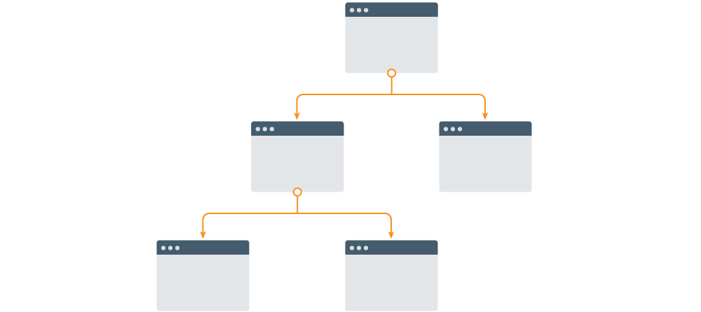
Does your information fall into a few overarching categories with a lot of information in each? A narrow and deep architecture will better serve the user in this case because it presents fewer options, decreasing his or her cognitive load. This setup is also useful for any workflow with multiple steps. The downsides are that it takes more clicks or touch points to arrive on their desired screen, and that users might get lost in the process and find it hard to backtrack.
For our purposes on this design project, we chose a wide, shallow navigation to allow the viewer to access quick information from several different places. We took the indicators for OEE and Skin Count Load off of the main screen and added tabs for easy, quick access without distracting the user from the screen overview.
2. Design the Appropriate Screen Layout for Your Content
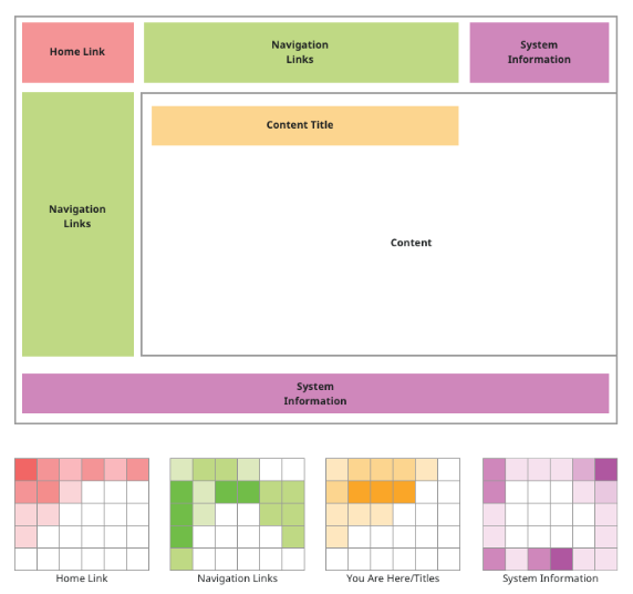
After determining the overall structure of your screens, you can start to plan your layout. This step is easy to overlook, but it is integral to creating the best experience for operators. The first step is to create a system of navigation. Typically, these can be broken into a few groups: primary top header, secondary top header, side navigation, and tabs.
Primary Top Header

The top header of an application is ideal for primary navigation. This is because users intuitively look here first on a screen, thanks to years of web use. Additionally, this placement separates the page’s content from the navigation, reducing confusion. Keep in mind that a horizontal navigation will restrict the number of links you can place, so it may be better suited for a narrow and deep project structure.
Secondary Top Header

This is a useful placement for when the primary top header isn’t large enough for all of your navigation. It has the same advantages and disadvantages as the primary header, but lends itself well to more complex navigational systems.
Side Navigation

This is a very common pattern as well, and is frequently combined with one or more top headers to form more complex navigation. It’s an effective schema to use if there are multiple linking objects, as the vertical structure naturally lends itself to a scrolling interface.
Tabs

Tabs are a great navigational choice for large applications because they are so intuitive. The IA design team utilized these for our first project. We also suggested a physical space by creating the illusion that the active tab is being brought to the forefront. Tabs also work vertically, if your space doesn’t allow for them to all fit across a screen horizontally. As mentioned earlier, we used tabs to separate out some information that wasn’t being efficiently displayed on the first screen.
3. Implementation and Best Practices
Now that you’ve determined your content’s structure and the right navigational components for your industrial interface, we can focus in on the smaller details of visual design. Here are a few best practices to follow when designing what your navigation will look like.
Affordance

Affordance might be an unfamiliar word to most, but the idea behind the term is quite simple: buttons should look like buttons, and links should look like links. If something in your design is clickable, clearly indicate that the section is linked. In the image above, the upper set of icons do not clearly indicate that they could be selected as links. The bottom icons have rounded edges, clear labeling, and slight shadowing, all design elements that look like the buttons all computer-users see on a daily basis. You could always take a look at some other high-performance HMI examples as well, but whatever way you choose to style your buttons or links, be sure to keep it consistent.
Page Names

Be sure to name and label each page you build. Keep your page names consistent so that your user can more effectively interact with the information. Page names also ground your users, who have learned to expect them from years of interacting with web pages.
Back Buttons

Back buttons are often overlooked by HMI designers, but they are extremely useful for operators. Be sure to include a back button or “up-one-level” link on each page that has sub-pages. By including this option, users are less likely to get lost in the interface.
Separate Categories and Utilities

It’s easy to confuse categories and utilities. Categories are content areas that link to main sections of your application. Utilities are links to important elements of the application that aren’t part of the content hierarchy, such as help screens, login portals, clocks and time displays, and more. Be sure to visually distinguish categories from utilities by separating them on the screen.
Here is the final product, with new and improved navigation:
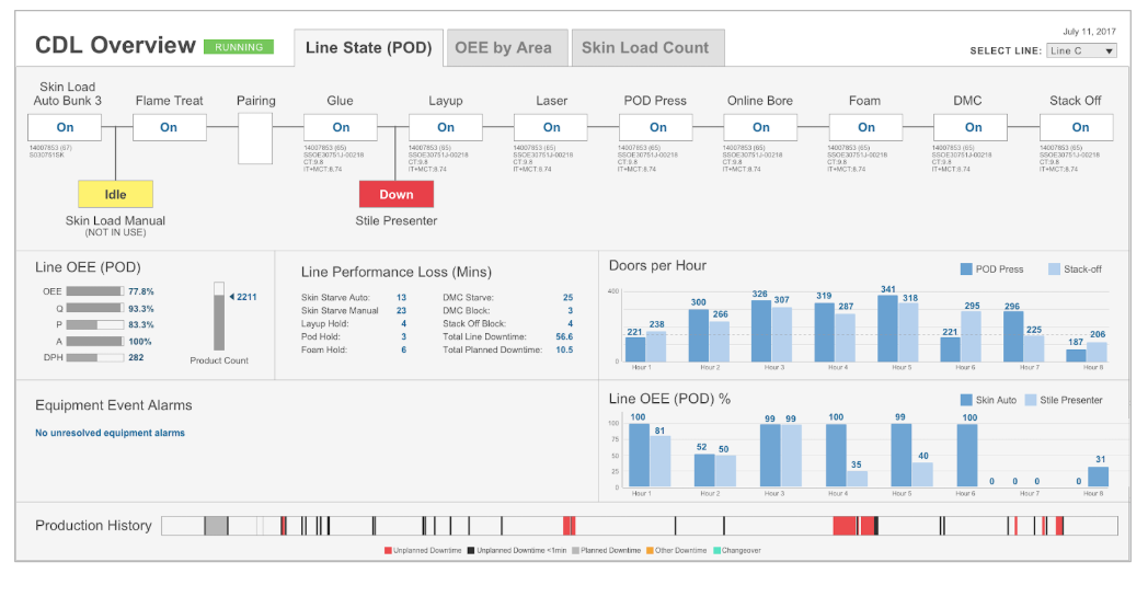
While this HMI navigation makeover may not seem as dramatic as an HMI design makeover on the surface, the improved user experience is invaluable to operators and managers alike. By rearranging the screen to easily orient users, our team enabled effortless navigation between different relevant interfaces. We added three tabs with different purposes to free up space and allow operators to access the appropriate information when they needed to. Finally, we used affordance principles to ensure users knew exactly what was a button or could be selected, and what was a static value.
Although HMI navigation is often challenging to conceptualize in the design process, it is a crucial piece of HMI design. Good navigational design can result in efficient monitoring, faster operator response times, and a better overall experience for your end users. With this guide, building out HMI navigation should be easy, and will create an intuitive interface for operator interaction.
Looking for more resources on HMI navigation design? We’ve got you covered:
I’ll be presenting a session on “Design Principles for Creating Mobile-Responsive HMIs” along with Perry Arellano-Jones at ICC 2018 this September. You can get more info here.

