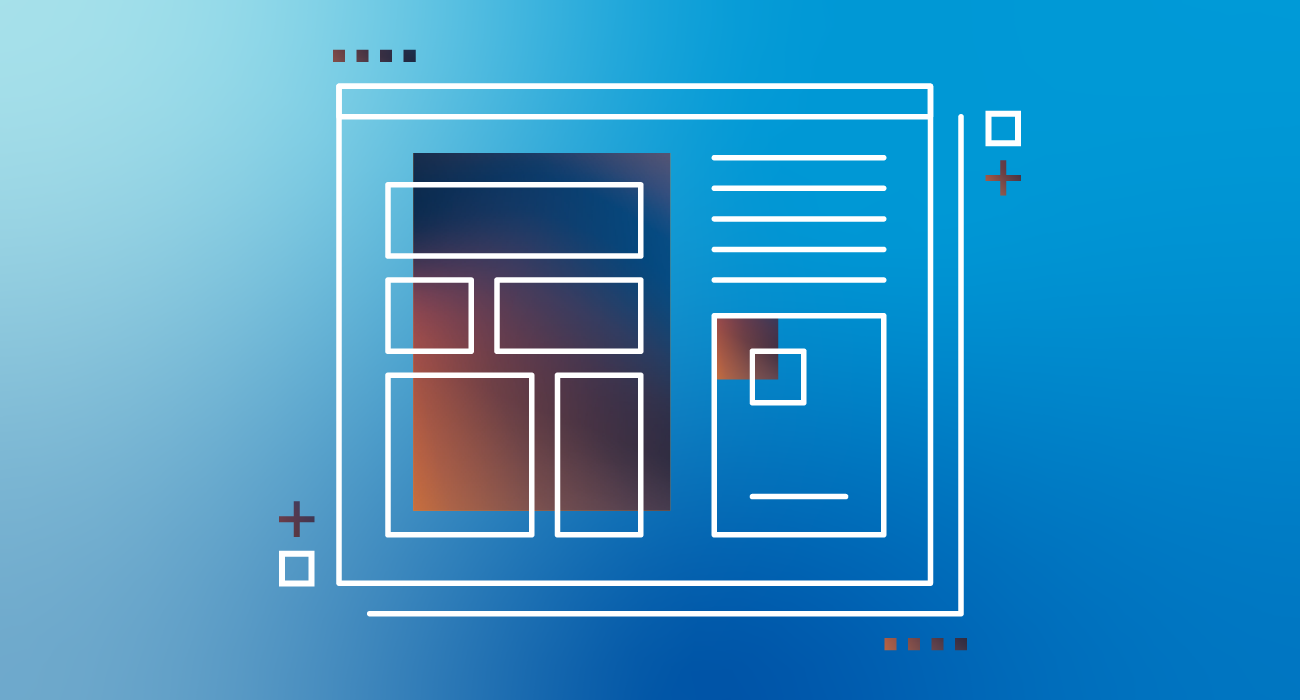
With the release of Ignition 8.0.13 comes an exciting new feature for the Ignition Perspective Module: Theming. Theming in Perspective allows users to customize the look and feel (not the layout) of their Perspective projects at a broad level.
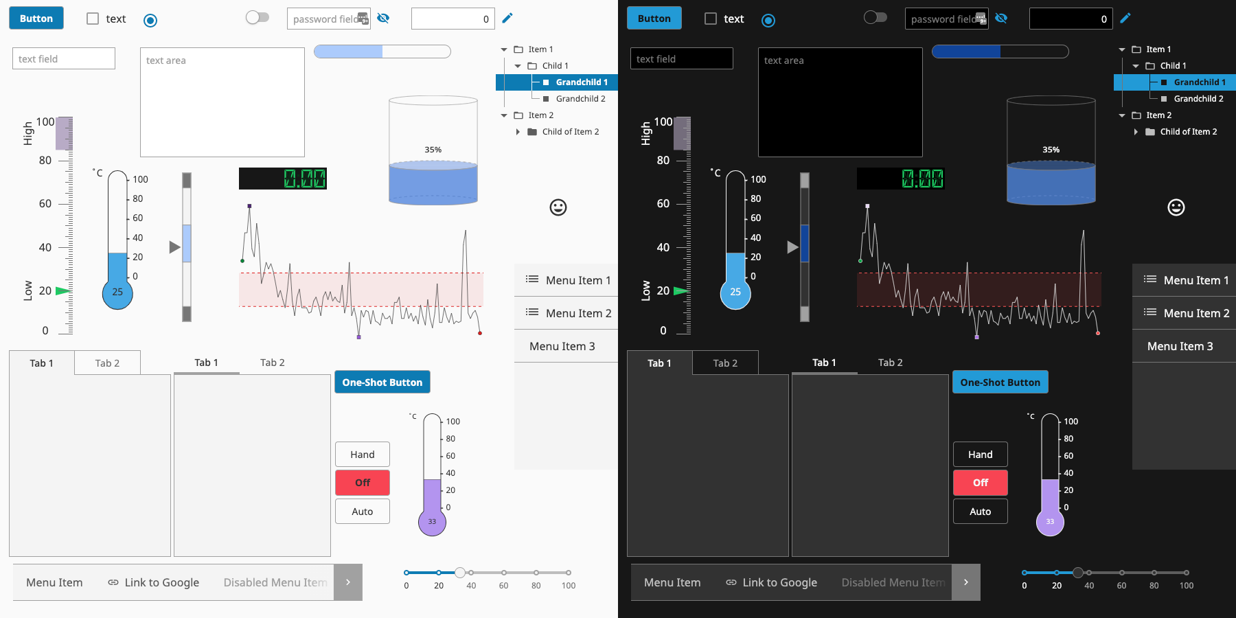
For the average Ignition user, theming adds the ability to choose one of our six built-in themes as a base look and feel across your entire application. As always, Perspective’s Styles allow you to make any visual tweaks or further, per-component styling customizations you may want to apply in the Designer.
For more advanced users seeking even more customization, a simple working knowledge of CSS enables you to roll up your sleeves and author your own custom themes. Our default themes are well-structured with variables, imports and descriptive class selectors, making them easy to duplicate and customize to your liking.
Why Did We Add Theming?
- Themes provide a unified and consistent visual design across all components by abstracting common elements (i.e. Button, InputField, Filter, CheckBox, etc.) into reusable libraries.
- The look and feel across browsers is now more consistent, retaining built-in functionality of existing components, and overriding the browser’s opinionated styling.
- They enable users to make sweeping changes across a project with very minimal effort. For example, changing the color of your primary action buttons across your entire application via one simple color variable.
- Along those same lines, our end users can create their own custom themes for Perspective applications easily.
- Designers can allow their end users to choose and set their own theme in the application itself. Certain users may prefer dark themes in an eye-straining environment while others may prefer a lighter interface.
Behind the Themes: Color Theories and Design Goals
We’re shipping the MVP of this feature with six theme choices. These include Light (our default), Light-Cool, Light-Warm, Dark, Dark-Cool, and Dark-Warm. Each of these themes is based on a system which includes three primary color palettes: neutrals, primary, and functional.
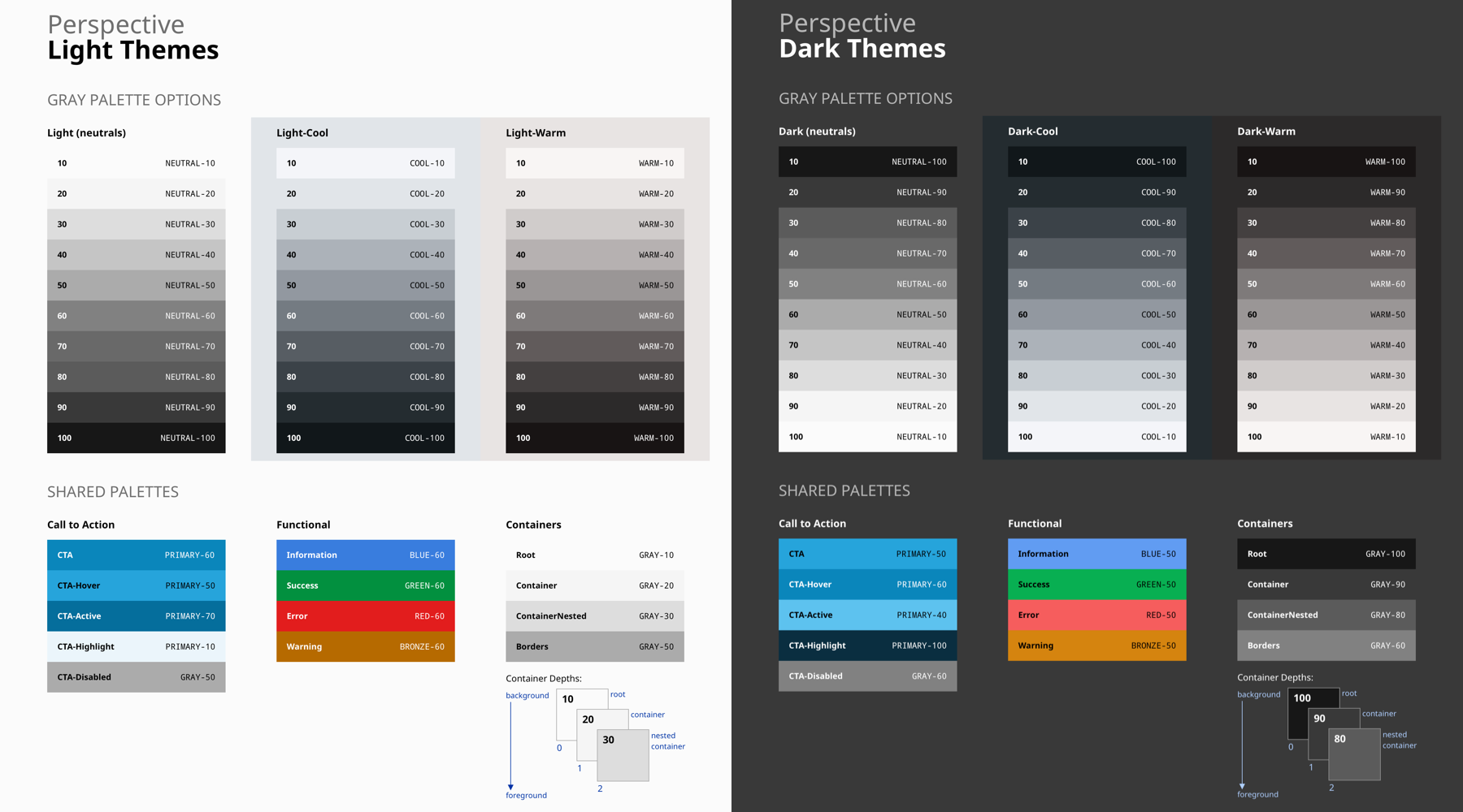
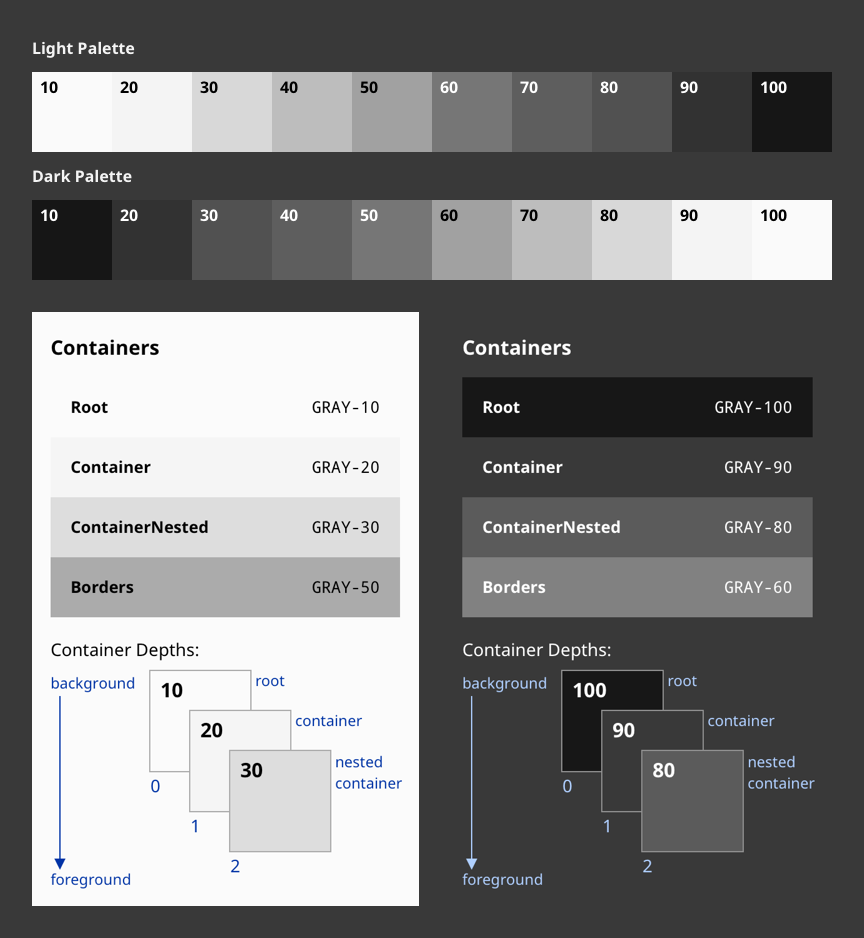
The Neutral palettes are used to style the base of our component interfaces, including things like container backgrounds, borders, and backgrounds. They’re intentionally neutral and are designed to get out of the way and fade into the background. While Light and Dark are nearly grayscale, the -Cool and -Warm variations introduce a subtle hint of color to the neutrals. This adds a bit more personality to an interface while remaining subtly in the background to more important elements which might require user attention.
Primary or “Call To Action” palettes, on the other hand, are used to attract attention and represent that an item is interactive. We’re using a palette of teal blues as the basis for our primary color because of its long history in product design, and the Internet in general, of being used for indicating.
Finally, our Functional palette includes colors which are used to represent a specific message to the end user. Similar to the color theories in HMI alarming, the use of this palette is very intentional and sparingly applied. We’ve included colors for error, warning, and success states. Additionally, a more subtle navy blue is used to present information.
Our themes have been carefully curated and designed with a few goals in mind. These goals include built-in accessibility, support for dark themes, more intentional data visualization, and a seamless upgrade experience.
Accessibility
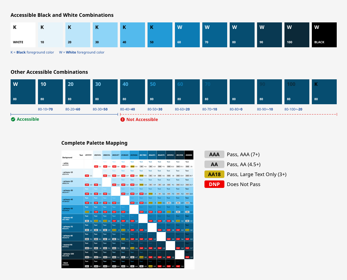
We made accessibility and contrast a cornerstone of our theming color systems. We wanted to ensure that the colors and typography baked into each component worked hand in hand, providing great readability, legibility, and compliant contrast levels. This makes it dead-simple for everyone using Ignition to create accessible applications.
The color families behind each color present in these themes contain 10 values from 10 to 100. White and Black sit outside those values. Black text is WCAG AA (4.5:1) accessible on colors ranging from 10 to 50. White text is accessible on colors from 60 to 100.
Beyond black and white, each color palette provides a range of accessible combinations. Subtracting the foreground value from the background value (or vice versa) helps determine whether that color combination meets the WCAG AA contrast ratio success criteria. If the difference between two values is 50 or greater, the colors are accessible. Anything below a difference of 50 may fail accessibility standards.
Dark Themes
Another goal was the support of compelling dark themes at launch. Dark themes reduce the luminance emitted by device screens, while still meeting minimum color contrast ratios. They help improve visual ergonomics by reducing eye strain and facilitate screen use in dark environments – all while conserving battery power.
To support dark themes, our neutral color palettes were designed with inversion in mind. In order to apply a dark theme, we’re able to simply invert the colors of our light neutral palettes in reverse order from the center. For example, what was 50 becomes 60 and so forth. The same accessibility math applies to these dark themes, so we’re able to know they’re legible.
Data Visualization
This goal is a bit more long-term and behind the scenes, but component theming is helping to lay the groundwork for our data visualization efforts. Alongside the palettes discussed above, we’re developing internal guidelines around effective data visualization and slowly rolling out better defaults to all components. As a part of this effort, we’ve defined three color palettes for data visualizations which are designed to maximize accessibility and harmony within themes. These data viz palettes include diverging, qualitative, and sequential.
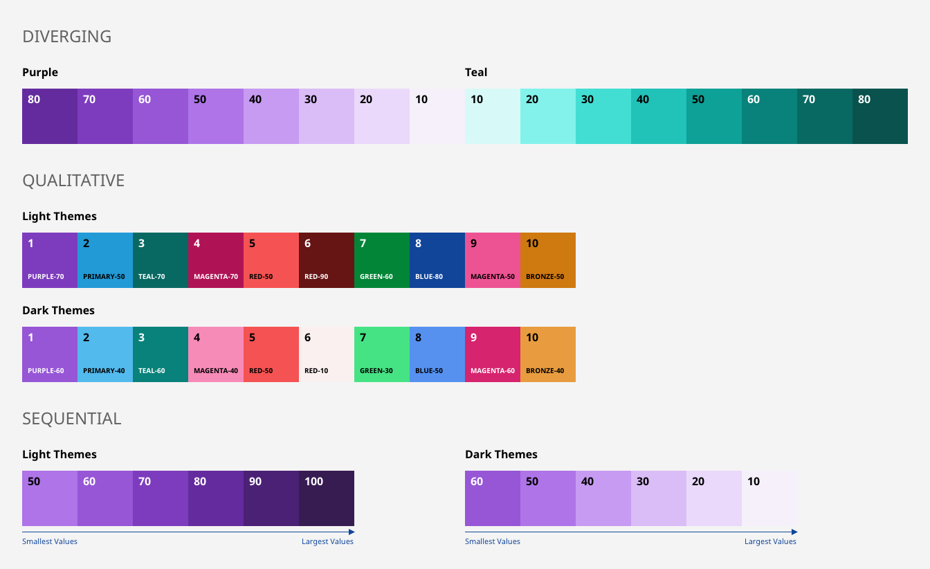
The purple-teal palette behind the diverging palette is good for most general data, such as performance or rates of change.
Qualitative (or Categorical) palettes are best when you want to distinguish discrete categories of data that do not have an inherent correlation. The sequence of the qualitative colors is carefully curated to maximize contrast between neighboring colors to help with visual differentiation.
Lastly, the sequential, monochromatic palette is good for relationship charts and trend charts. In light themes, the darkest color denotes the largest values. In dark themes, the lightest color denotes the largest values.
Seamless Upgrades
As a core goal of the project, most users won’t notice much of a change to their applications upon upgrade. The Light theme continues to be the default for new applications, and is designed to carry through most of the same styling that’s existed already. What we did change, we changed intentionally for reasons described above related to accessibility or reusability within other components.
So, while we’ve worked hard to ensure upgrading won’t cause any drastic changes, there are some points worth noting as you approach the upgrade:
- Some component schemas may have also changed in order to support theming. At a minimum, this means removal of many default color values. In some cases, additional properties were added or deprecated.
- The checkbox component has been altered to render as an SVG for checked, unchecked, and indeterminate states. This is modeled after Material UI's React library and was done to provide designers with the ability to change icons and apply styles for different states while also making it cross-browser compatible and compatible with theming.
- The progress component has been redesigned. As a result, its properties, which were previously lacking, have also been updated.
- The default font family has changed from Roboto to Noto Sans in order to support more languages and future localization efforts. Noto Sans renders slightly wider characters, which may require some layout re-work in dense layouts with hard-coded widths.
We’re confident that the introduction of themes will strengthen the Ignition platform as a whole and continue to enable our brilliant community of users to design, build, and ship more intentional and progressive industrial applications.
Using Themes
This feature is live now in Ignition 8.0.13, available on our Downloads page. Upgrade to this version and explore themes for yourself today. Here are just a few ways in which you might want to explore the feature:
Change the Default Theme
- Upgrade Ignition to 8.0.13 (or get a new, free installer from our Downloads page)
- In Perspective Session properties, enter any of our six pre-built theme options. These names are case-sensitive, so you should provide the lower-case filename with NO filetype extension, i.e. “light,” “light-cool,” “light-warm,” “dark,” “dark-cool,” or “dark-warm.”
- That’s it! Your theme will auto-apply new base styles across every component in your application. As usual, changes can be seen live in the Designer and in your browser.
Enable End Users to Switch Themes in the Runtime
We’ve built in a few methods to extend the theming decision to your end-users in Perspective applications themselves. This can be accomplished via Scripting or Actions. In a script, system.perspective.setTheme("themeName") or self.session.theme = “themeName” may be used. If you’d prefer another route, we’ve added a new Action appropriately named Theme. As you may expect, this can be used to set the theme to whichever you configure.
Author a Custom Theme
This article is an introduction to the idea of theming in Perspective. Once you understand the concept and are ready to get more technical by implementing a theme of your own, our development team has another guide for you. In the themes folder, you’ll find a README doc which aims to be an introductory guide to custom theming in Perspective. Any additional technical details you may need as a theme author can be found there.

I hope you’ll enjoy exploring the new Perspective Themes and, as always, visit our ideas portal whenever you want to share ideas for new features and improvements.