Design Like a Pro: Optimizing Your HMI
Four Tips for More Effective HMI Screens
12 minute read Download PDF
The value of any tool is judged by how well it helps the person using it to accomplish what they need to do.
A hammer is judged by how well it drives nails and a shovel is assessed by its effectiveness in digging holes. Likewise, the value of a Human-Machine Interface (HMI) is derived from how well it helps the plant-floor operator to oversee the manufacturing process.
No matter how automated a manufacturing process may be, there is still a need for an operator to monitor it, control it, and, at times, intervene to resolve problems. The HMI is a tool that helps to maintain safety and improve productivity in all kinds of industrial facilities. By conveying important information effectively, a high-performance HMI can aid operators in quickly assessing what needs to be done.
However, when an HMI is not in an optimal state it can become more of an obstacle than a solution. One of the most common HMI problems is that the screens get so cluttered with color and detail that it’s difficult for the operator to quickly assess the situation. This is especially true if the operator doesn’t possess a high level of training.
Tips to Design More Effective HMI Screens
The key to cleaning up your HMI is to always focus on making it the best possible tool for the operator.
The main goals of HMI design are:
- To turn data into information
- To draw attention to the most important information
Therefore, the design choices for your HMI project should always be dictated by one question: How can the HMI maximize the operator’s efficiency? The goal is not to make the HMI graphics as visually interesting as possible; in fact, focusing on making the screens look “cool” or packing them with as much information as possible actually makes them less effective.
Everything about an HMI project should be focused on one specific purpose: making it the best tool it can possibly be for the end user. By turning data into information and emphasizing the most important information, you can help reduce the operator’s reaction time when problems arise.
To help you design HMI screens that are optimized to improve performance, we have assembled several design tips. This white paper covers some of the most powerful design principles you can use to optimize your HMI projects: analog displays, trends, emphasis, and navigation.
Tip 1: Use Analog Displays
Analog displays are more effective than digital displays at putting data into a practical context. For example, think of an analog watch and a digital watch. When you’re in a hurry, which watch is better at showing you how much time you have until your next meeting? The digital watch simply has numbers that show you what time it is. An analog watch displays the current time and it makes it easy to see how much time is left until your next meeting. From that small example, you can imagine how much easier analog displays make it to assess dozens of process values on a screen.
With analog displays in your HMI, the operator can instantly see where the current conditions stand in comparison to desired conditions. There are a number of analog displays that you can use in your HMI project. Moving analog indicators and radar charts are two that you can use in Ignition.
Moving Analog Indicators
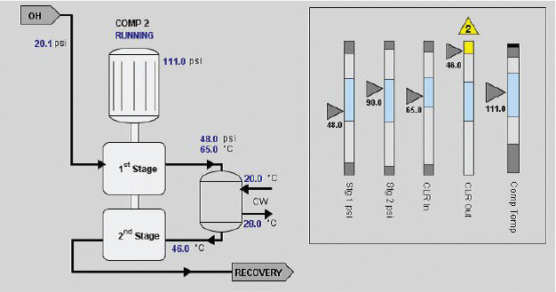
These components display an analog value in context with other information about that value. The current value is shown as an arrow pointing at a bar with segments that show the desired operating range, low and high alarm ranges, and interlock ranges.
By looking at a moving analog indicator, the operator can see at a glance if the value is in its normal range or if it needs attention. If the value is in an alarm range, then that range changes color.
Radar Charts
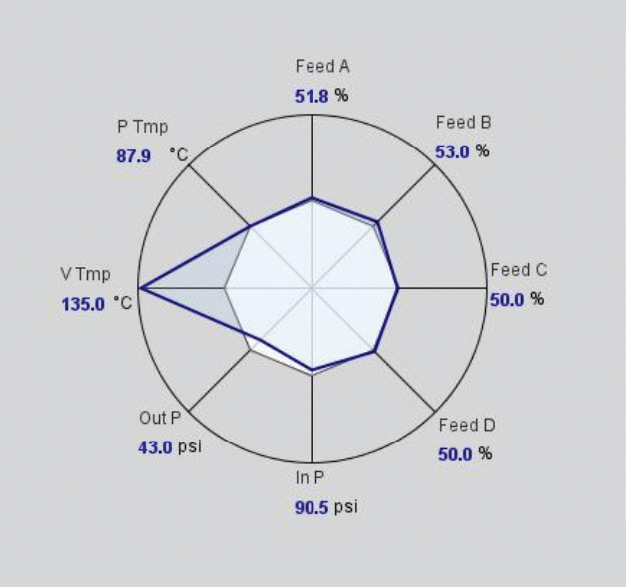
Also known as web charts, spider charts, or spider plots, these circular charts display several values at a glance. At a glance, it can show the operator whether a process is running on-spec or off-spec.
In a radar chart, each value is plotted like a spoke on a wheel. Inside the wheel are two shapes: one shape is formed by a line between the current values, and the other shape represents how all the values would look if they were in their desired range.
In the chart below, you can easily see which values are running outside their desired ranges.
Tip 2: Use Embedded Trends
When an operator looks at a display of current data, he only sees what the conditions are at that moment. But to manage an operation effectively, the operator needs to be able to anticipate potential problems, and for that he needs more context.
When the HMI contains trending information, the operator can see what the conditions have been, where they are now, and where they are likely to head next. If the operator can see that a value is trending up and is going to cause a problem later if it continues in that direction, he has a chance to prevent a problem from happening. For this reason, we recommended that you use embedded trends for important information and key performance indicators (KPIs).
Sparkline Charts
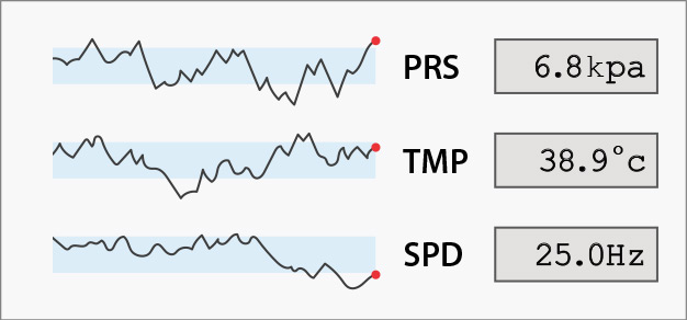
In Ignition, embedded trends are called sparkline charts. A sparkline chart is a minimalistic chart component that displays a line-chart history for a single data point. It shows a great deal of contextual information in a very small amount of space.
By binding the property of a sparkline chart component to a SQL query or a tag history, the operator can see what the value has been over the last few minutes or hours. For example, by placing a sparkline chart next to or on top of a tank component, you can track whether the tank’s temperature is rising, falling, or oscillating.
Tip 3: Use Emphasis Techniques
To help an operator quickly assess the process and take any necessary actions, an HMI must be designed to show the operator what’s important by deliberately calling attention to it. The best way to do this is to use a design principle called emphasis.
In an HMI project, using emphasis means giving an object, component, or data point special significance in order to focus the operator’s attention on the information that is most important to their job.
What to Emphasize
To effectively use emphasis, you must first determine what information is most crucial for the operator to see. To do this, evaluate the HMI screen and rank the information and functions according to how important each one is to the operator’s job. The higher the importance, the more emphasis it should have to quickly catch the operator’s attention. Keep in mind that this hierarchy of importance can change from operator to operator and you may need to look at HMI examples to learn more about how to tailor each HMI screen to satisfy individual needs.
There are several ways to give one element emphasis over another, but the four simplest and most powerful techniques are size, color, position, and isolation.
3.1: Size

This is easy to see because the larger square is clearly different from the others, so it draws our attention. This is because the human eye is incredibly attuned to finding patterns, and anything that breaks a pattern will immediately draw our attention. In this case, all the squares are the same size, except one; therefore, the larger square has more emphasis than the others.
Applying this to an HMI project can be very straightforward: the larger the element on the screen, the more attention it will command. This only works if the size difference is relative to other elements on the screen. If all the elements on a screen are large, none of them will have emphasis over the others.
3.2: Color 
The orange square stands out because it’s different from the others. Whenever a familiar pattern is broken, emphasis is created. The more a color contrasts with its surroundings the more emphasis it will have.
Complementary colors are greatly different from one another because they are opposite from each other on the color wheel. Using complementary colors together can be a good way of creating emphasis.
In an HMI project, color is especially useful in creating effective alerts. To draw an operator’s eyes quickly, use a color that will easily stand out. To do this, the color needs to be unique on the screen, so if your HMI screen is predominantly blue, don’t make your alert blue, make it orange. The general rule for the color of HMI screens is to keep them neutral (not too light or dark) and monotone (one color). Gray is a good choice because it will easily allow colors to pop out and it draws the operator’s attention to maximize emphasis.
3.3: Position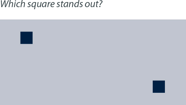
The average viewer tends to say the square on the top left. This is because in Western cultures, people typically read from top to bottom and left to right, and as a result our eyes are trained to move across a page in a certain way. You can take advantage of this by placing elements you want to emphasize in places that our eyes expect to see them. Objects of high importance should reside in the top left of a screen or page.
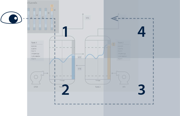
This principle can be effectively used in HMI screens as well. To do this, you can break the screen into four quadrants. The top left is the most highly traveled by the viewer’s eye, so it is prime real estate; whatever you put there will get noticed. The bottom right is less traveled; information placed there will still be seen but will have less importance.
3.4: Isolation
The single square separated from the group of squares stands out because it is isolated from the others. Isolation is created when an object has empty space around it; this creates emphasis which can easily draw a viewer’s eye. The more empty space around an object, the more emphasis the object will have. If you take a blank piece of paper and put a single dot on it, your eye will immediately be drawn to the dot. Regardless of how small the dot is, its isolation gives it huge emphasis.
To effectively use isolation in an HMI project, make sure your HMI screen is not cluttered. The more information that is displayed on an HMI screen, the more difficult it is to draw an operator’s attention to one specific part of it. Keep your screens simple and it will be easier for operators to focus on what is important. The simpler the screen, the more
3.5: Animation
Animation can also be used for emphasis, but it should never be used gratuitously. You shouldn’t use animation to illustrate a normal situation or process, but only to highlight abnormal situations. It should always be placed in the foreground, not the background, since the purpose of using it is to get attention.
3.6: Redundant Coding
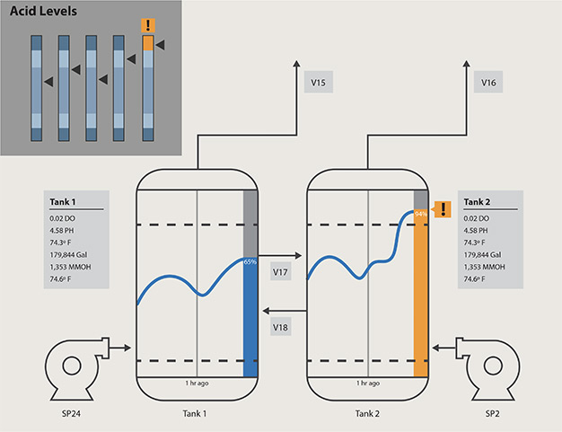
Rather than using these techniques on their own, it is recommended to combine techniques to create even greater emphasis. For example, the moving analog indicator shown in this paper used both color and position to display that a value had gone into an alarm state. The use of more than one emphasis technique to convey urgent information is called redundant coding.
By combining emphasis techniques, you can create a hierarchy of importance for each element on the screen. Check out other HMI examples and experiment with different combinations to find and create the desired effect. Remember that the goal of using emphasis in your HMI project is to make it a more effective tool in the hands of its operator.
Tip 4: Set Up Navigation
Set up your navigation to create a data hierarchy in the HMI. Instead of cramming an excessive amount of details onto one screen, a properly set-up navigation provides a progressive exposure of process detail. The general idea is to show the operator a big-picture view at the top of the navigation and then he can take actions and get more specific details as he clicks down through the levels.
Recommended Hierarchy Levels:
Level 1 is the Area Overview. This is a high-level overview and should immediately show if there is a problem. This level is for situational awareness. Think of Level 1 as the 30,000-foot view of a process, under the control of one operator or group. This screen should instantly show whether everything is running well or if something is wrong.
Level 2 is for Unit Control or ongoing process manipulation. If the operator notices a situation at Level 1 that needs attention, he can click into Level 2 to take action.
Level 3 is for Unit Detail, where the operator can click on a unit and get a detailed examination of it. For example, he can click on a motor and get a pop-up window that contains detailed information about it.
Level 4 is for Support and Diagnostics; i.e., troubleshooting. This level is for storing standard operating procedures, diagnostic info logs, event histories, and other things of that nature. When the operator has a question about what to do in certain situations, this is the place to look.
The most important guideline in setting up the hierarchy is to use one that best fits your SCADA system. Creating this type of navigation may take more work but it will make the HMI much easier for the operator to use.
Focus on Operator Needs
The most important goals to focus on for optimizing the HMI are to turn data into useful information and to draw attention to the information that is most important for the operator to see. You should use analog displays to put data into context. Use embedded trends that show where data is heading. Use color, position, isolation, and size to emphasize important information. Set up a navigation hierarchy that provides progressive levels of detail. Look at high-performance HMI examples to learn more about building HMIs. By applying these best practices, the operator will be well-equipped to keep the plant running as safely, securely, and efficiently as possible.
For more tips to hone your HMI skills, our new blog post: "10 Pro HMI Design Tips: Build Screens Faster In Ignition" offers some valuable advice.
Source: The tips in this white paper are based on The High-Performance HMI Handbook by Bill Hollifield, Dana Oliver, Ian Nimmo, and Eddie Habibi. Inductive Automation recommends this book as an additional resource for HMI best practices.
Want to stay up-to-date with us?
Sign up for our weekly News Feed.
