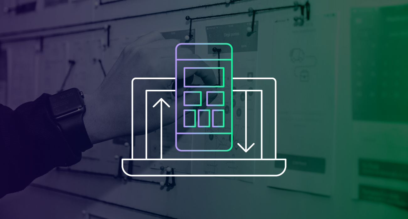
As the use of smartphones and tablets continues to become more widespread, the development of mobile applications for industrial automation is becoming increasingly important. These devices are now the most popular form of technology in the world, and that trend shows no sign of slowing down. By taking advantage of the convenience, accessibility, and capabilities of mobile devices and apps, industrial organizations can streamline their processes, increase efficiency, and stay ahead of the competition.
A well-designed app should put the user in control of the interface, making it simple and forgiving, and encouraging exploration. Additionally, the app should protect the user's data as much as possible and use smart defaults to make it more accessible. In this post, we will discuss some strategies to help you achieve these goals.

1. Don’t Underestimate the Importance of Interface Design
Mobile application design plays a pivotal role in creating a connection between the user and the application. By balancing visual form and technical functionality, the interface provides an exceptional user experience. That’s why a well-designed interface is essential to creating a user-friendly mobile application.
Every element of the interface is important, especially in the small space of a mobile device, where even the smallest issues and oversights can be easily noticeable and affect the user's experience. If the interface is confusing or difficult to use, users will not engage with the application, regardless of the valuable functionality or convenience it may offer.
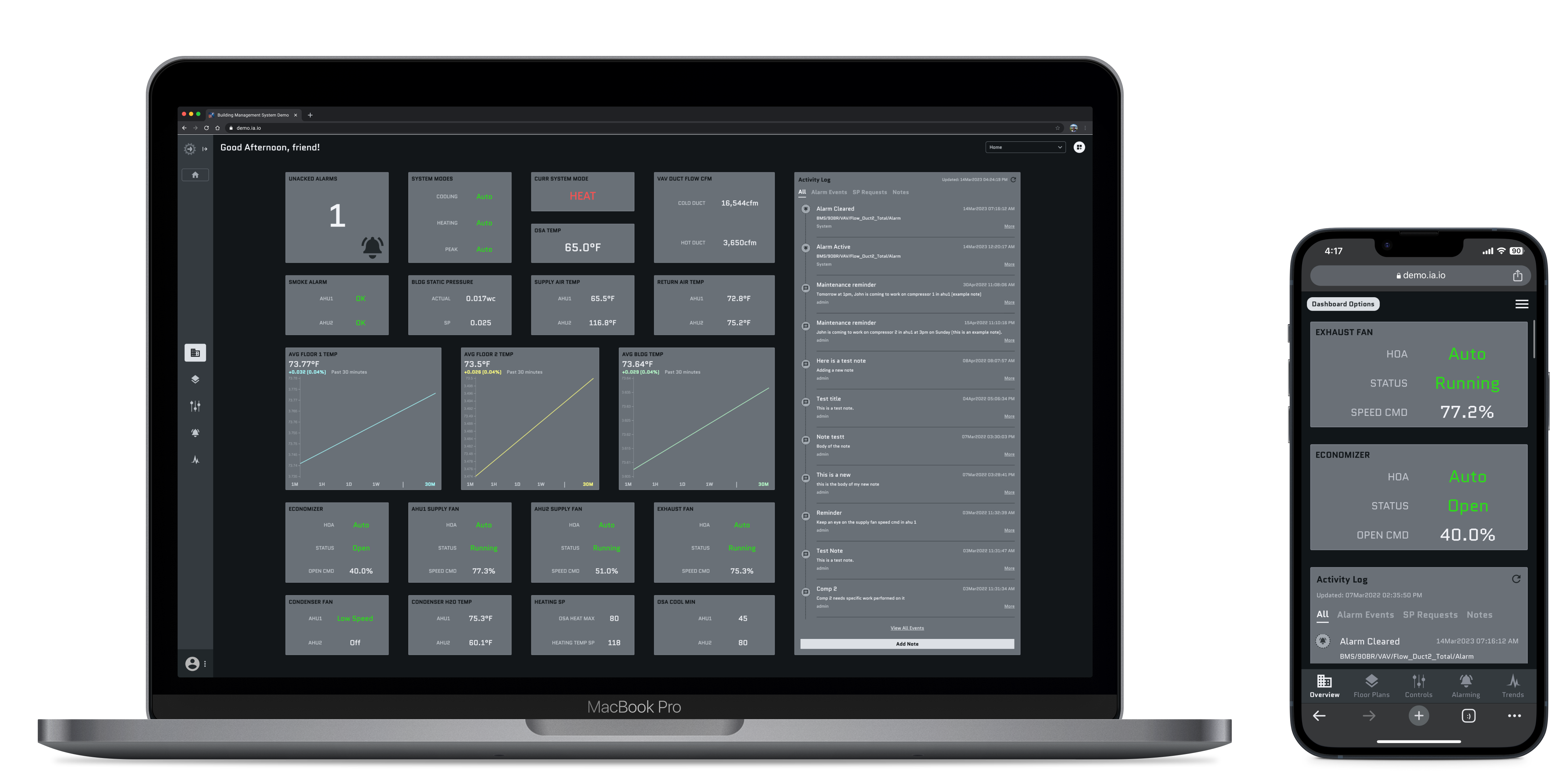
Also, you should strive for feature parity between your desktop and your mobile application. While mobile applications are presented in a smaller space, that doesn’t mean they should offer less to the user. However, you will need to refine and streamline the most important information to show what is absolutely necessary on the surface. From this point, you can add functionality that allows users to dig deeper into more detailed information.

2. Put the User in Control of the Interface
The structure of your application is most effective for users when it's easy and intuitive to navigate with an informative and welcoming atmosphere.
The application should provide feedback like automatic acknowledging messages triggered by certain actions, error screens, loading screens, and visible reactions to operating certain buttons that inform the user that the app is responding to make your application as easy to use and understandable as possible. Sometimes these little things may seem unnecessary for the function of your application, but they reduce human error and keep the user reassured and informed.
Context is paramount to a functional control system. The best way to provide context is through your application's UI with visual cues such as navigation indicators, global search controls, filters and page and section titles. When your application is completed, you should be able to answer these four questions on every screen: 'Where am I? How did I get here? What can I do here? And where can I go from here?'
By maintaining page titles, subtitles with visual hierarchies, and global actions on each screen, you can tell the user exactly where they are and where they can go from there. Visual cues like a familiar main screen layout with navigation capabilities and prompts for reversible actions help you find where you came from and how you got there. Building an architecture with reversible action prompts such as UNDO or CANCEL buttons when the user attempts an irreversible action or simply a BACK button available on each page also creates a forgiving environment and promotes exploration.


It should be easy for the user to learn and understand your application. Global actions like Search bars to allow users to access any information they need, interactive buttons with drop-down menus for changing authentication states, and a drop-down menu for settings and customization should be visible on every page. Consistent controls from page to page make the user more comfortable exploring without the fear of getting lost in the application.

3. Make Interactions Comfortable for the User
Your mobile interface should revolve around accessibility, which you can achieve by implementing strategies such as built-in work protection, thoughtful color design, effective error handling, and smart defaults.
Keeping the users’ data safe is one of the most important functions of an application. Your application should protect saved work and data whenever possible through features like confirmation pop-ups, or by allowing access to deleted files for a set amount of time so they can recover them if needed.
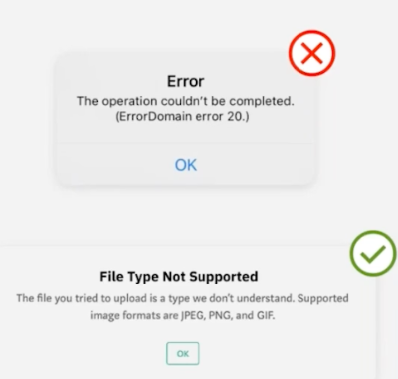
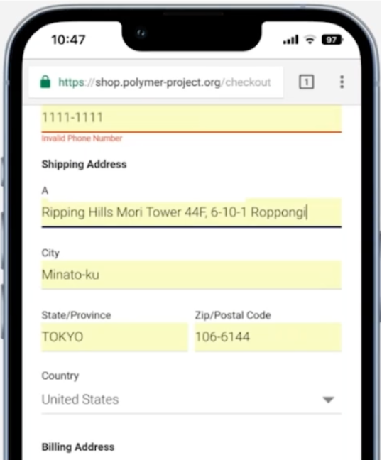
Color is one element of design that has a strong impact on accessibility. Many people have trouble seeing specific colors, so building multiple colors and indicators into buttons, messages, and error notifications in your application ensures everyone understands the message equally. Using color, shapes, symbols or icons, and designs can also help you design for errors the user will inevitably make throughout your application. For example, using a red circle with an X inside is a great way to use multiple indications of an error. The color red indicates an error has been made, and so does the X. The same goes for a green circle with a check mark inside. The color green indicates an affirmative action along with the check mark.
Smart defaults allow your application to perform the maximum amount of work while requiring the minimum amount of information from the user. Smart defaults maximize accessibility by remembering and automatically entering information. One of the most tedious and frustrating aspects of many applications is retyping usernames and passwords and manually searching for frequently used items every time you open the application. Smart defaults rank your searches by most searched and automatically populate your information as soon as you enter your fingerprint, PIN, password, or any other form of simple authentication.

4. Combine Strategies for Accessibility and User Control
The design of a mobile application is critical to providing a great user experience. Putting the user in control of the interface, giving informative feedback, and offering ample context can encourage users to explore without fear of making mistakes while also being simple and forgiving. Additionally, you can build trust and make applications more user-friendly by designing for accessibility, protect the user's data by employing robust security measures, and minimize cognitive load by using smart defaults.
By combining welcoming UI and building accessibility into your application, you can create a mobile interface that serves its intended purpose and is pleasing to use time and time again.
Want to master mobile interface design? To learn the best practices for optimizing mobile design for a seamless user experience, check out our webinar featuring Inductive Automation’s Design Department Manager, Ray Sensenbach. Or, you can learn more about building mobile-responsive industrial applications with the Ignition Perspective Module.